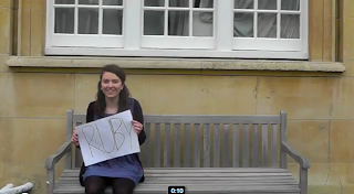
This is a screenshot from my video, which shows us using a photo of a brick wall for our background.
I followed a similar theme for my ancillary tasks, as I felt this showed a strong urban theme. We wanted to show that our singer was very much london based in the video, through the shots of the london eye. The brick wall simply adds to the urban feel, but because the saturation is higher it shows the singer's brand and genre. We used high saturation throughout our entire video, so itr makes sense that it would also be used for the advert and digipak.
For both the ancillary tasks I used the same front cover photograph. This would be more effective when it comes to promoting the album, as the audience would recognise the image and be more likely to pick the album up in a shop. This means that the image itself is very important, as it has to appeal to the target market. I brightened the colours by boosting the saturation, and I used a very open image of the singer, which tells the audience who she is and what she looks like.
This screenshot from the video also shows 'Ruby' wearing the same dress as she does in the photograph. This shows a link between the three tasks. Also, I used a handwriting style font, which can be linked to this screenshot as Ruby's name is in handwriting.
I think that the three products work well together, as they link subtly without making it obvious but they are all very similar. I think the look of all three will very much appeal to the target market. I think we have represented Ruby Reigns as being a quirky young woman with a colourful look, which is typical for singers in this genre of music.


No comments:
Post a Comment