Digipak

Magazine Advert

Friday, 27 April 2012
Tuesday, 24 April 2012
Question 3: What have you learned from your audience feedback?
First, we asked our target audience a general question on their overall opinion of our video. We asked 30 girls and women ranging in age from 15-25, some on Facebook and some in person. Here were the results:

For our more in depth audience feedback, we decided to do a survey. These were the questions we asked:
1. What did you like about the video (even if you didn't like it overall)?
For this one, we gave them the option to pick multiple choices.

The narrative and the shots seem to be the most popular elements of our music video, which we thought would be the case due to prior knowledge of our audience. Luckily, even most of those who didn't like the video overall enjoyed certain elements, so that is quite positive. The information also shows that the song we picked was appropriate for the target market, and the video accordingly.
2. What was your favourite part of the video and why?
The results for this one was quite hard to put into a graph, so instead I'll just sum up the answers.
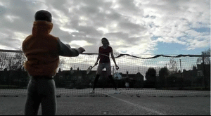
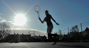
The most popular part of the video was the part when Ken is hit by the tennis ball, as most people found it very funny,
Make gifs
but they also found Alice's expressions while playing tennis good too.
Webcam to gif
Most of the audience were more attracted to the humorous moments of the video rather than the technical, which is what we expected as we know humour appeals to this market.
Many also enjoyed some of the shots, particularly the ones of the skate park and the tennis shots, as they were quite thought through visually and made quite an impression.
Cam to gif
Overall, this gave us a better idea of what the audience thought was good rather than the overall appeal of the video.
3.Was the storyline easy to follow?
We also gave people multiple choices to give us a more accurate idea of how obvious the storyline was to the audience.

so luckily the majority did seem to. It also shows us how effective our uses of connotations and signifiers were, which will be useful when it comes to our exam.
4. Was the bright effect on the shots good and was it appropriate for the artist?
We got some very positive feedback from this, as many said that the bright shots really made the video stand out and looked really effective. Many people also said that it worked very well with the Ruby brand image of a young woman, and added to the use of fridge magnet letters and scrabble pieces, which fits with our perceptions of the target audience.
5. Did the locations fit in with the video?
Again, we got some very positive feedback for this as many congratulated us on the range of locations. Many also thought that they were appropriate for the london theme, especially the shots of the escalator in the London Underground:
And also the shot of the London eye:
6. Did you feel that our video subverted stereotypes in any way?
Wee again the audience a couple of choices for this section, as we wanted to get a more balanced answer rather than just yes and no.

Luckily again the audience seemed to agree that we subverted stereotypes by using the ken doll, and they liked amny sa\i that they liked Ruby's representation as it was unlike most music videos, which have a very heavy use of the male gaze. Those who said no said that they felt the close ups of the lips showed the male gaze as many music videos do, and didn't feel that the use of the Ken doll was in any way symbolic. This shows us that maybe we didn't use enough cultural and symbolic codes in the video to get this point across, but as the majority agreed that stereotypes were subverted, so we're not too worried.
We also recorded a few reactions to the video from Andrea. We asked her a couple of our questions and this was her response:
We also used Twitter to show how artists use social networking to get closer to their fans - it also means they can easily promote their releases without having to pay for advertising, which makes spending money on advertising less necessary, meaning the artist and record company gets more money.
These are some screenshots of Ruby Reigns' account:

It is also a good way of getting audience feedback and seeing how fans react to the artist's releases. Here are some responses we got:

As you can see, this makes it easier for the artist to get feedback and it makes our project more authentic and shows that we have used a variety of media to promote the artist.
Monday, 23 April 2012
Question 2: How effective is the combination of your main product and ancillary texts?
This is a screenshot from my video, which shows us using a photo of a brick wall for our background.

I followed a similar theme for my ancillary tasks, as I felt this showed a strong urban theme. We wanted to show that our singer was very much london based in the video, through the shots of the london eye. The brick wall simply adds to the urban feel, but because the saturation is higher it shows the singer's brand and genre. We used high saturation throughout our entire video, so itr makes sense that it would also be used for the advert and digipak.

For both the ancillary tasks I used the same front cover photograph. This would be more effective when it comes to promoting the album, as the audience would recognise the image and be more likely to pick the album up in a shop. This means that the image itself is very important, as it has to appeal to the target market. I brightened the colours by boosting the saturation, and I used a very open image of the singer, which tells the audience who she is and what she looks like.

This screenshot from the video also shows 'Ruby' wearing the same dress as she does in the photograph. This shows a link between the three tasks. Also, I used a handwriting style font, which can be linked to this screenshot as Ruby's name is in handwriting.

I think that the three products work well together, as they link subtly without making it obvious but they are all very similar. I think the look of all three will very much appeal to the target market. I think we have represented Ruby Reigns as being a quirky young woman with a colourful look, which is typical for singers in this genre of music.
Sunday, 22 April 2012
Monday, 26 March 2012
Sunday, 25 March 2012
Music Video Analysis - Digital Technology
Digital Technology

We decided to use a panning shot of London to set the scene for the video, which is set in London. We had to use a tripod to keep this shot as steady as possible, so that the panning shot looked as professional as possible. We also edited the raw footage in iMovie to make it look more interesting, as the original footage was taken on a very grey day, and that didn't fit in with the theme of our video. We used the 'saturation' and 'brightness' controls on iMovie to make the shot look brighter and more eye catching as well as making the shot more genre appropriate, and fit the cheerful vibe of the song better.

In this shot we had to use the zoom out control on the camera, so that the shot looked like it was following Ruby. We felt that lots of shots in our video were still, as we did not really have the technology for lots of good panning shots, and the video did not looks as effective. This meant that we had to include movement in shots when possible, so we tried with this shot. It was quite an issue to get it right, as I had to pan out at the exact same pace that Alice was walking, so we had many out takes. This worked in our favour though, as towards the end of the video we used one of the out takes towards the end of the video that zoomed out too fast to break the fourth wall. This also made the video look less formal and made it more personal to the fans as the clip looks more like a 'behind the scenes' clip rather than having been shot specially for the video.

To again break the fourth wall in the video and involve the viewers in the video a bit more, we use the tripod to wobble the camera when Ruby storms off after getting annoyed with Ken while playing tennis. This make it look as if she has hit the camera, therefore showing that there is a camera there. This shows that the artist is aware she is being filmed, and almost means she comes out of character. It is also symbolic, as it shows her sense of aggression and frustration with Ken, so the viewer understands the storyline and realises that she is not happy in her relationship.
Saturday, 24 March 2012
Music Video Analysis - Creativity
Creativity

In order to show our creativity, we had to put a lot of thought into each shot so that it involved as many themes in the video as possible. For example, in this shot we used fridge magnet letters to show Ruby's youth, as they often signify childhood. The letters are also in bright colours, so the bright theme is shown, setting the scene for the rest of the video. The record player also shows the video's retro vibe, which is again shown throughout the video. This use of creative elements in the video creates a fun, quirky feel.

We also used more props to introduce characters, for example here we use scrabble and the Ken doll. This is again to show the childlike image of the singer, as she is technically playing with toys, which is unusual behaviour for a teenager/young adult. The use of Ken instead of a real boyfriend could also show Ruby's desire to stay young, which is a common issue with the age group we are aiming our music video at. The brick wall background also shows the urban, London based theme of the video, and shows that we used a lot of resources to create each shot.

Finally, for this shot we had to wait until it was around valentine's day to get the right kind of confetti, as it was harder to get red heart shaped confetti at any other time of year. We wanted it to be red because it was symbolic of Ruby's name, and heart shaped because it shows that the theme of the video is love. We also didn't plan to do this shot in our original storyboard, but we came up with it when we were deciding what we would use the confetti for. As we didn't have the right sized tripod, I had to use a pile of books to keep this panning shot steady.
Thursday, 22 March 2012
Music Video Analysis - Using Conventions From Real Media Texts
Using Conventions From Real Media Texts

For this extreme close up shot we took inspiration from other influences such as musician Jessie J, who, as part of her brand image, has quite a strong focus on her lips, using lots of lip art such as union flags. We tried to also use lip tatoos, but we found that they were quite difficult to get a professional finish, so instead we opted for bright red lipstick, as a reference to Ruby's name. We used this to show when Ruby was whistling, however it got quite repetitive, so we used a few alternative shots of her walking so that the lip shots are more interesting when they are used. The slightly smudged imperfection of the lipstick again shows Ruby's youth and quirkyness, as if it was applied perfectly she would look too grown up and professional. This way the target audience, teenage girls, are more likely to relate to her, rather than being shown professionally done make up that they would never be able to achieve themselves.

In most music videos of the solo indie pop genre, the artist is the focus of the video, and is often playing an acting role in the video as well as singing. We followed this convention, as our music video had a narrative theme. This mid shot shows a combination of the performance element, i.e the lipsynching, and the narrative, which is when Ruby has been given the flower by Ken.

We followed the conventions of having a relationship featured in the music video, as many music videos in our genre have this focus, especially with love songs. This is because our genre's audience is mostly female, and teenage girls are more likely to watch a music video if it features a relationship. We did subvert the conventions slightly, however, as the relationship, rather than being between a girl and a boy, is between a girl and a doll. We took inspiration from Olly Murs' video for his song 'Busy', which features a relationship between him and a paper mache mannequin. This particular long shot shows Ruby and Ken gwetting on well together in their 'relationship', which is also highhlighted by the bright colours and the fact she is holding him rather than putting distance between them as she has done previously in the video.
Wednesday, 21 March 2012
Music Video Analysis - Research and Planning
Research and Planning

We did lots of planning for when we shot the footage of the skate park in Alexandra Palace, as we had to research the area, how to get there and what kind of shots we would do. this way we were able to be fully prepared, as well as have plenty of time to get all the shots we needed. One thing we couldn't predict. however, were the other people in the skate park. However, we had to carry on filming despite some embarrassment. We also had to know what things to bring with us as well, such as video camera, tripod, Ken doll, oyster cards and I also brought my camera so what we would be able to have some good images of the location for our blogs. For this mid shot there is a distance between Ruby and Ken, which again shows that they are not getting on well. This is also emphasised by the way Ruby is 'looking down' on Ken. showing that she has the power in the relationship.

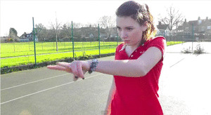
We also did lots of planning for the filming for the part in the video when Ruby is waiting for Ken after she has prepared a special valentine's day celebration for him. We planned on filming this a few days before valentine's day itself, as we knew that the sort of things we'd need for the shoot would only really be in shops around then. We bought things like red heart confetti, a red pretend flower, heart chocolates and a toast stamp that said the words 'I love you'. This meant we were prepared for this shoot, as well as having the camera etc with us. For this mid shot we had to do quite a lot of preparation, such as light and arrange the candles. We also had to decide on the camera movement, which was a panning shot of the table. This adds the hermeneutic code to the video (Barthes), as we do not know where the shot is going until it reveals her sitting at the table. The fact that she is checking her watch is also a semantic code, as the underlining meaning to this action shows that she is waiting for someone, and as an audience we can work this out before it is revealed by Ken arriving, as that is how we interpret this action.

Monday, 19 March 2012
Music Video Analysis - Post Production
Post Production

This close up shot of the scrabble pieces spelling out the word 'presenting' has been changed in iMovie, using a video effect called 'Vignette'. This adds focus to the word, as well as giving the clip an old-fashioned, pinhole effect that works well with the music video's retro meets contemporary theme. The use of scrabble also adds a childlike feel, which also goes with the use of the Ken doll, and the other signifiers in the video that Ruby is young (Strausse). After doing some research at the beginning of the project, we found that many music videos in the indie pop genre introduced the artist with text, for example in the music video for Olly Murs' song 'Busy'. As our music video had a lot of similarities to this video, we decided that this would be a good way of 'presenting' our artist.

A split screen is often used in music videos to show contrast, much like in Daniel Powter's music video for his song 'Bad Day'. We used Final Cut express to make the split screen, and the use of symmetry is used to show that although everything looks similar, the situation is entirely different. The split screen shows the ups and downs of Ruby and Ken's relationship, as it is good one minute and bad the next. The composition of the shot is focused on the sofa, as it is what stays the same in both shots. The use of Ken and Ruby sitting on opposite sides of the sofa is a symbolic code (Barthes), as we are taught that any couple with distance between them shows they are having problems and have recently had an argument. The lower shot shows them as being close, and even having Ruby lying on Ken's side of the sofa, which signifies that she is in control of the space, therefore is in control of the relationship. The use of red in the shot, as well as being a metaphor for Ruby, as rubies are usually red, shows anger in the top screen and love in the bottom, which again shows the contrast, even though things look the same.

In iMovie we used a transition called 'Circle Open' to create a shot that alludes to Ken being hit by the tennis ball. This is an example of an action code (Barthes), as we do not see the actual action occur, but we are able to work it out through the use of other cultural codes. The use of the comic book style 'POW!' is a cultural code, as only certain cultures would be familiar with comic books and the use of onomatopoeia. The use of the 'POW!' also shows the viewer that this is not a realistic world they are seeing, but rather a figment of a young person's imagination, namely Ruby's. The use of the transition being circular signifies (Strausse) the tennis ball, which also adds to the action code, as we do not see Ken being hit. The use of the bright primary colours in the image shows again that Ruby is young, as primary colours are often used on child's toys. It also stands out and goes well with the bright and colourful theme of the video.
Friday, 16 March 2012

Thursday, 15 March 2012
Magazine Advert: The Comparison

After designing two different magazine adverts, both in the style of musician's adverts who my target market would be fans of. I thought that the one on the left was quite striking and bold, but quite dark and not as eye catching, however I also thought that the one on the right didn't have enough information on it. I posted this image on Facebook, as I thought that it would be better to ask the consumer what they would prefer as an advert. This is a few of the results:

As you can see by these replies, the result was that the second advert was preferred to the first, as it is 'fresher and more modern', and 'less is more'. I have decided to tweak the second one as well, as it isn't quite perfect yet, but the basic frame is much more popular than the other one. I was going to do a graph for the results, but as the results are all the same but one, so it wouldn't be a very interesting graph. For the sake of making my blog more varied, however, here it is:

Wednesday, 14 March 2012
Draft 3
This is our third draft. I think that the new beginning works really well with the genre, as the record player adds to the vintage look and feel of the video, as well as adding the sense of voyeurism as she is listening to her own record. The colourful letter magnets also add to the childlike, brightly coloured theme to the video, putting an emphasis on 'Ruby's youth. We have also added the toast section of our video, which will go right at the end when we have added all of our footage. We like this bit because it is again using stop frame animation, which adds to the quirky nature of the video. We have decided to sort out all the lip synching once the footage has all been added, as otherwise we will be wasting valuable editing time on something that we will only need to change again later.
Tuesday, 13 March 2012
Second Magazine Advert Draft
For the second draft of my magazine advert, I decided to got for a more photo-based advert, where the image took up the whole page, much like the Marina and the Diamonds advert. I used the image from the album cover, as I thought it was more likely to be recognised and would fit in well with my album cover. However, I did have some trouble deciding on what colour font to use:

I first decided to use a blue similar to Alice's dress, as it showed up well against the orangey background, however it looked a bit too artificial and a little bit tacky. It did go well with the colourful theme of Ruby Reigns, though.

I then tried white font, as it was what I used on the actual album cover, but I found that it isn't very eye catching, which doesn't matter quite so much on an album cover, but an advertisement is to sell the album, so the text would need to be eye catching.

I then tried out black font, which I found worked well, as it stands out well and is easy to read. I did worry, however that I would need to put more text on the image and the black would not necessarily stand out as well against her tights.

Therefore, for the finished piece I decided to use white writing lower down. I really like this design overall, as it is simple, colourful and eye catching, as well as telling the audience all the information necessary.
Monday, 12 March 2012
First Magazine Advert Draft

This is my first draft of the magazine advert. I used inspiration from the Florence + The Machine magazine advert, as I liked the idea of framing the album cover photo with black and white boarders, as it looks very simple, yet professional. It also makes the image stand out more, and as this would be trying to sell the album it means the audience will know what the album looks like when they come to either buying it in a shop or on iTunes. Overall I like this draft, as it is effective and shows the artist without being too garish or messy. It also fits well with the indie pop genre, as it includes colours, but does not make the poster too bright, as that would make the poster look more like the musician's genre was electro pop.
Sunday, 11 March 2012

Saturday, 10 March 2012

Thursday, 8 March 2012

Monday, 5 March 2012
Useful article
I just found this article in 'I' newspaper, and I think it seems very relevant to the collective identity part of our exam.

Friday, 24 February 2012
Draft 2
One of the main things about this draft that stands out to me is that the editing is not very fast paced and doesn't quite fit to the music. When we finish adding all the footage, we should make this a priority to make out music video the best it can be.
Friday, 10 February 2012
First Draft
This is the first draft for our film. The lip synching is a bit off, and there are lots of things we still need to film, but it's a start.
Monday, 30 January 2012
Photos
For one of our shots we are planning to have our artist looking through some old-fashioned photos. To do this I used the app Hipstamatic on my iPhone, which takes photos with a vintage camera effect. Here we took lots of photos of 'Ruby' and 'Ken' in London, to make it look like they have been on lots of dates. I also took some photos of other footage on our computer screen to show variety in the photos.


Subscribe to:
Posts (Atom)