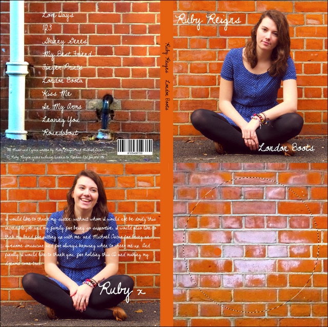
Digipak
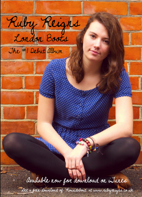
Magazine Advert
Friday 27 April 2012
Tuesday 24 April 2012
Question 3: What have you learned from your audience feedback?
First, we asked our target audience a general question on their overall opinion of our video. We asked 30 girls and women ranging in age from 15-25, some on Facebook and some in person. Here were the results:

For our more in depth audience feedback, we decided to do a survey. These were the questions we asked:
1. What did you like about the video (even if you didn't like it overall)?
For this one, we gave them the option to pick multiple choices.

The narrative and the shots seem to be the most popular elements of our music video, which we thought would be the case due to prior knowledge of our audience. Luckily, even most of those who didn't like the video overall enjoyed certain elements, so that is quite positive. The information also shows that the song we picked was appropriate for the target market, and the video accordingly.
2. What was your favourite part of the video and why?
The results for this one was quite hard to put into a graph, so instead I'll just sum up the answers.
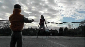
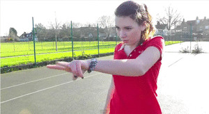
The most popular part of the video was the part when Ken is hit by the tennis ball, as most people found it very funny,
Make gifs
but they also found Alice's expressions while playing tennis good too.
Webcam to gif
Most of the audience were more attracted to the humorous moments of the video rather than the technical, which is what we expected as we know humour appeals to this market.
Many also enjoyed some of the shots, particularly the ones of the skate park and the tennis shots, as they were quite thought through visually and made quite an impression.

Cam to gif
Overall, this gave us a better idea of what the audience thought was good rather than the overall appeal of the video.
3.Was the storyline easy to follow?
We also gave people multiple choices to give us a more accurate idea of how obvious the storyline was to the audience.

so luckily the majority did seem to. It also shows us how effective our uses of connotations and signifiers were, which will be useful when it comes to our exam.
4. Was the bright effect on the shots good and was it appropriate for the artist?
We got some very positive feedback from this, as many said that the bright shots really made the video stand out and looked really effective. Many people also said that it worked very well with the Ruby brand image of a young woman, and added to the use of fridge magnet letters and scrabble pieces, which fits with our perceptions of the target audience.
5. Did the locations fit in with the video?
Again, we got some very positive feedback for this as many congratulated us on the range of locations. Many also thought that they were appropriate for the london theme, especially the shots of the escalator in the London Underground:
And also the shot of the London eye:
6. Did you feel that our video subverted stereotypes in any way?
Wee again the audience a couple of choices for this section, as we wanted to get a more balanced answer rather than just yes and no.

Luckily again the audience seemed to agree that we subverted stereotypes by using the ken doll, and they liked amny sa\i that they liked Ruby's representation as it was unlike most music videos, which have a very heavy use of the male gaze. Those who said no said that they felt the close ups of the lips showed the male gaze as many music videos do, and didn't feel that the use of the Ken doll was in any way symbolic. This shows us that maybe we didn't use enough cultural and symbolic codes in the video to get this point across, but as the majority agreed that stereotypes were subverted, so we're not too worried.
We also recorded a few reactions to the video from Andrea. We asked her a couple of our questions and this was her response:
We also used Twitter to show how artists use social networking to get closer to their fans - it also means they can easily promote their releases without having to pay for advertising, which makes spending money on advertising less necessary, meaning the artist and record company gets more money.
These are some screenshots of Ruby Reigns' account:

It is also a good way of getting audience feedback and seeing how fans react to the artist's releases. Here are some responses we got:

As you can see, this makes it easier for the artist to get feedback and it makes our project more authentic and shows that we have used a variety of media to promote the artist.
Monday 23 April 2012
Question 2: How effective is the combination of your main product and ancillary texts?
This is a screenshot from my video, which shows us using a photo of a brick wall for our background.

I followed a similar theme for my ancillary tasks, as I felt this showed a strong urban theme. We wanted to show that our singer was very much london based in the video, through the shots of the london eye. The brick wall simply adds to the urban feel, but because the saturation is higher it shows the singer's brand and genre. We used high saturation throughout our entire video, so itr makes sense that it would also be used for the advert and digipak.

For both the ancillary tasks I used the same front cover photograph. This would be more effective when it comes to promoting the album, as the audience would recognise the image and be more likely to pick the album up in a shop. This means that the image itself is very important, as it has to appeal to the target market. I brightened the colours by boosting the saturation, and I used a very open image of the singer, which tells the audience who she is and what she looks like.

This screenshot from the video also shows 'Ruby' wearing the same dress as she does in the photograph. This shows a link between the three tasks. Also, I used a handwriting style font, which can be linked to this screenshot as Ruby's name is in handwriting.

I think that the three products work well together, as they link subtly without making it obvious but they are all very similar. I think the look of all three will very much appeal to the target market. I think we have represented Ruby Reigns as being a quirky young woman with a colourful look, which is typical for singers in this genre of music.
Sunday 22 April 2012
Monday 26 March 2012
Sunday 25 March 2012
Music Video Analysis - Digital Technology
Digital Technology

We decided to use a panning shot of London to set the scene for the video, which is set in London. We had to use a tripod to keep this shot as steady as possible, so that the panning shot looked as professional as possible. We also edited the raw footage in iMovie to make it look more interesting, as the original footage was taken on a very grey day, and that didn't fit in with the theme of our video. We used the 'saturation' and 'brightness' controls on iMovie to make the shot look brighter and more eye catching as well as making the shot more genre appropriate, and fit the cheerful vibe of the song better.

In this shot we had to use the zoom out control on the camera, so that the shot looked like it was following Ruby. We felt that lots of shots in our video were still, as we did not really have the technology for lots of good panning shots, and the video did not looks as effective. This meant that we had to include movement in shots when possible, so we tried with this shot. It was quite an issue to get it right, as I had to pan out at the exact same pace that Alice was walking, so we had many out takes. This worked in our favour though, as towards the end of the video we used one of the out takes towards the end of the video that zoomed out too fast to break the fourth wall. This also made the video look less formal and made it more personal to the fans as the clip looks more like a 'behind the scenes' clip rather than having been shot specially for the video.

To again break the fourth wall in the video and involve the viewers in the video a bit more, we use the tripod to wobble the camera when Ruby storms off after getting annoyed with Ken while playing tennis. This make it look as if she has hit the camera, therefore showing that there is a camera there. This shows that the artist is aware she is being filmed, and almost means she comes out of character. It is also symbolic, as it shows her sense of aggression and frustration with Ken, so the viewer understands the storyline and realises that she is not happy in her relationship.
Subscribe to:
Posts (Atom)