Music Video

Digipak

Digipak

Magazine Advert

Magazine Advert

Thursday 22 December 2011

CD Analysis - Wallis Bird

Wallis Bird is an Irish folk/punk/indie artist, which  is quite different in genre to our artist, bu I thought that the theme of this cover is particularly interesting, as it includes unusual graphics and artwork.


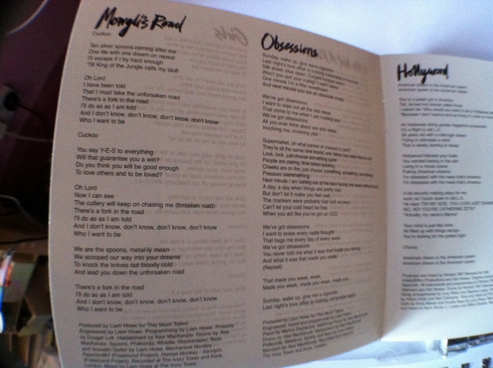
This cover also uses a font that looks like handwriting, which looks really unusual and adds a personal touch to the album, making the consumer think that that might be the artist's handwriting. 


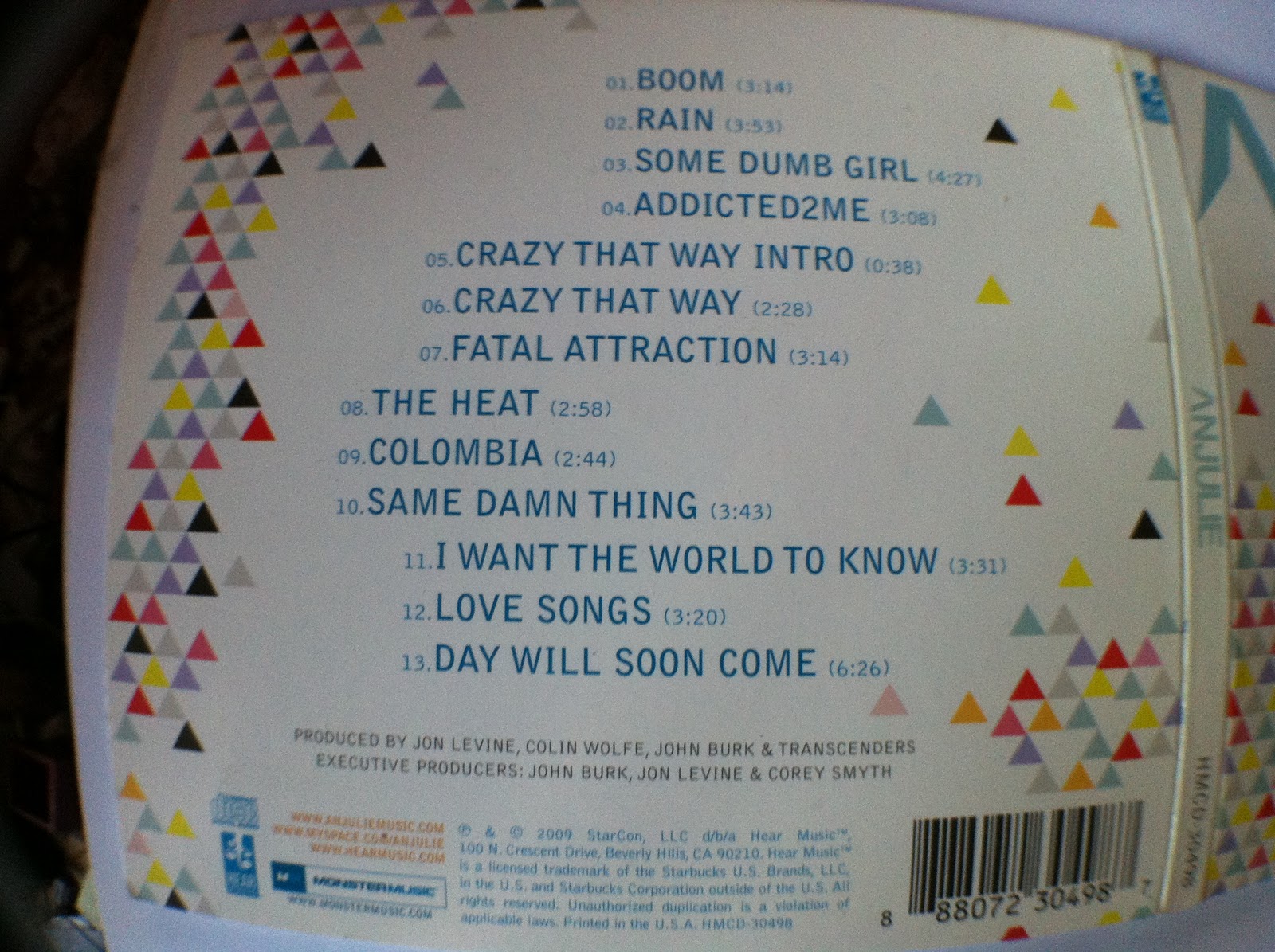
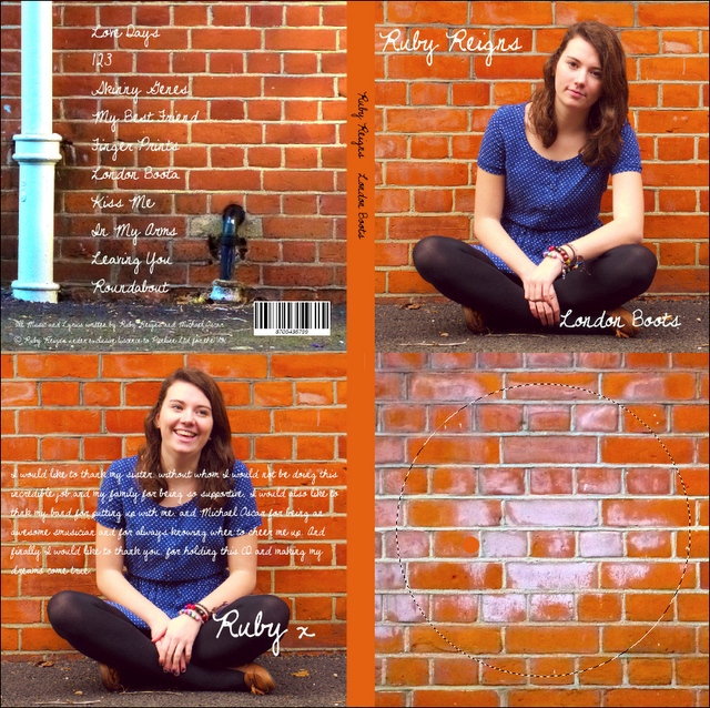
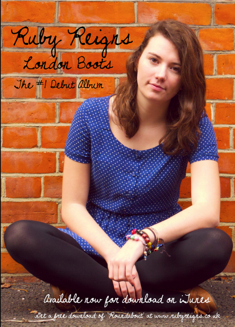
The artist's website and credits are also included on the cover...


As well as a barcode...


And the production company logos on the spine.


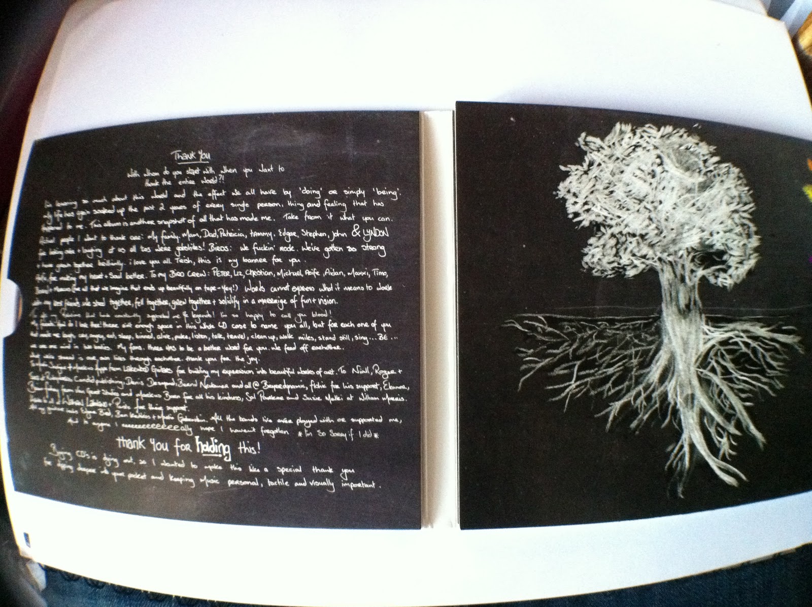
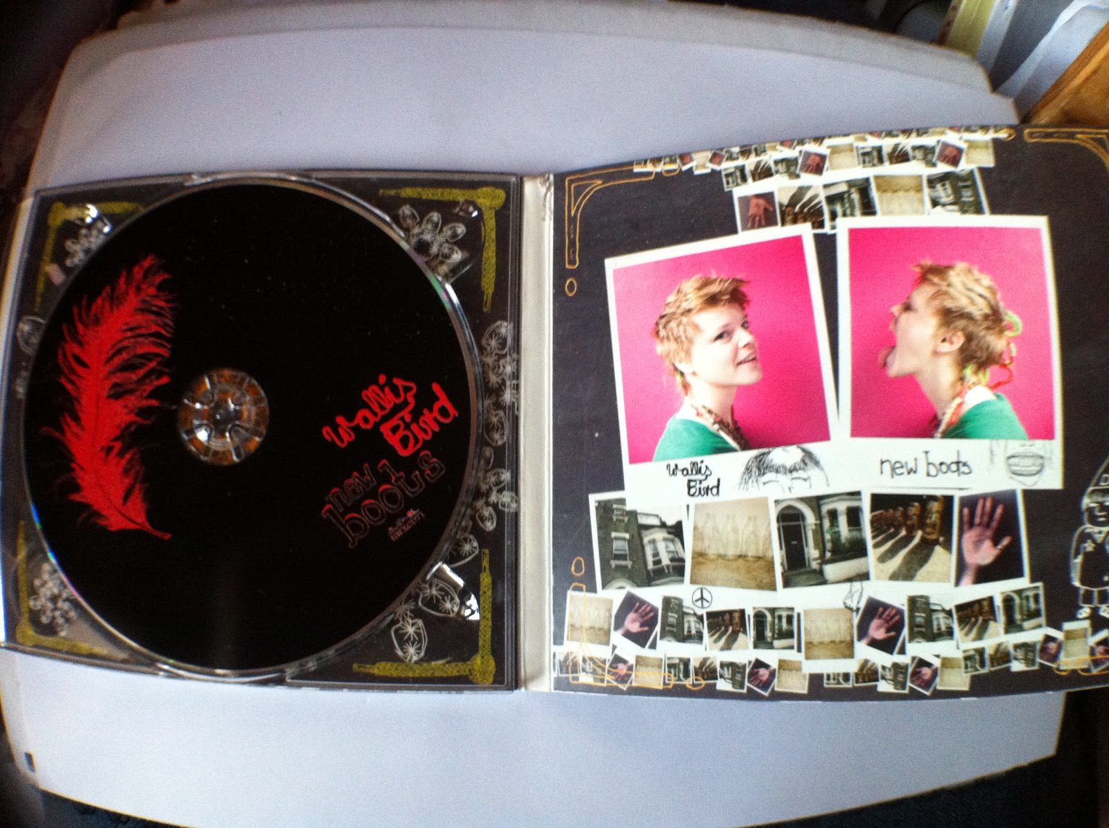
The combination of drawings and photos also give this album cover a scrapbooky feel, and the black background and white writing makes it look like the album is a chalkboard, an element i really like, as it makes me think of childhood and youth, which is the theme we are trying to show with the use of barbie dolls. 


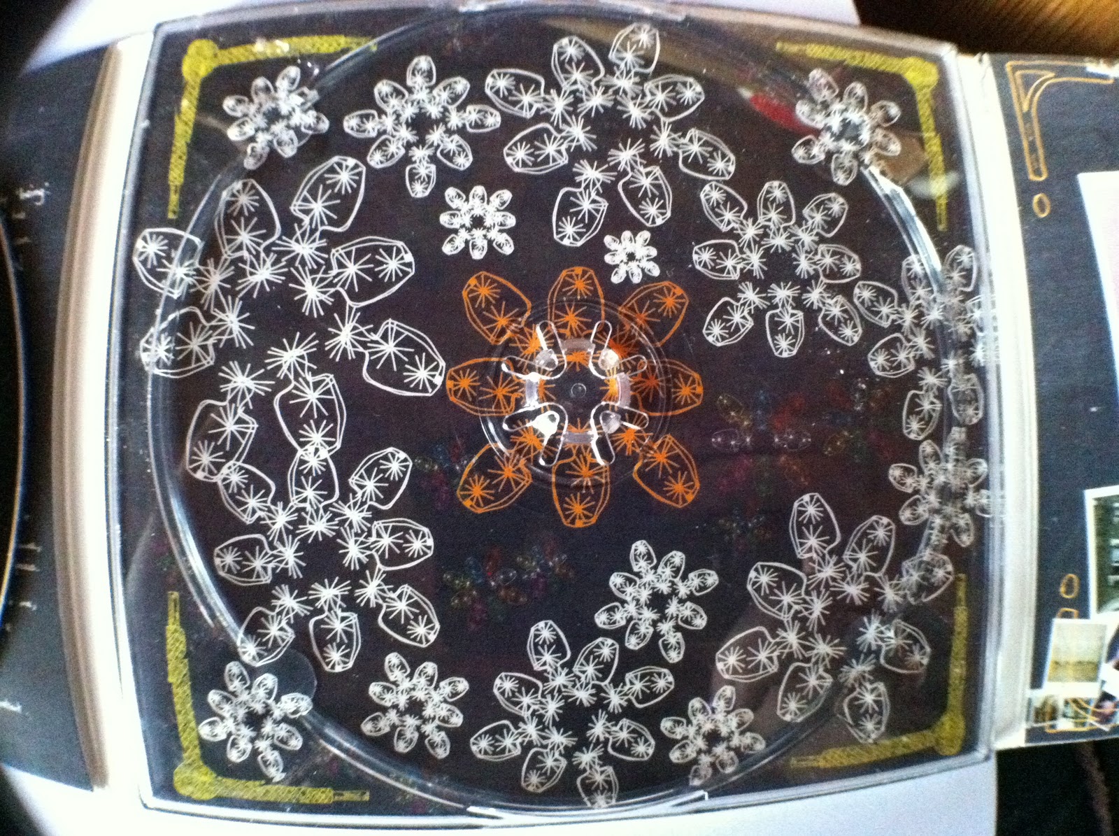
The various illustrations throughout the cover also add a childlike theme, that I will find useful when making my cover.


There are also lots of credits for the band, which isn't usually done as much with mainstream pop music as the main artist is the focus of the music. This shows how indie musicians are usually a lot more reliant on their band, and tend to keep the same band for as much of their music as possible, whereas in pop the musicians are usually only employed for particular songs, meaning the solo artist doesn't develop much of a relationship with their band.


The use of lots of pictures also adds to the scrapbook feel of the cover.

I have found this album cover particularly useful as it has given me some inspiration for the themes of my album cover, and has shown me the difference between various genres and their look, and what is important to focus on in my genre.

Wednesday 21 December 2011

CD Analysis - Anjulie

I don't have many digipak CD cases, as I tend to buy albums on iTunes nowadays, but one of the few I do have is this album by Anjulie. She isn't very well known about, but I thought this was a perfect example of an indie pop female solo artist to look at for inspiration: 


The cover features another stylised photograph of the artist, as well as the bold triangle graphics, which are quite eye catching and introduce the colour scheme.


The CD is black with some triangles and the logo on it, making it stand out, but still work well with the theme of the CD cover.


The booklet is inside a slot, which is often the case for Digipaks.


The booklet also features the lyrics in a colour font that works with the colour scheme. I also really like the idea of combining graphics and photograph to create the artist's dress.


Another thing I have been seeing in these CD covers is that most of the booklets include a 'thank you' page, which I will probably include in my own CD cover, as it adds a personal touch as well as being fitting with the genre of the artist.

Tuesday 20 December 2011

CD Analysis - Katy Perry

A far more mainstream artist than Marina, however I think that the styling again is something to look at in this CD cover:

The case includes many pictures of Katy Perry at the MTV performance the CD is of, which is typical for this genre.


The font is quite rounded, and there is a clear pink, white and black colour scheme throughout the case.

The pink strawberry on the CD stands out against the black background, and it helps the consumer to see that although it's not a studio recorded album, this is still an official Katy Perry recording.


The inside booklet also contains lots more pictures of Perry, along with some credits.


I think that this was a useful case to look at, as the eye catching pop art graphics and photos of the artist are very typical to the genre and apply to our artist's look and styling.

Monday 19 December 2011

CD Analysis - Marina and the Diamonds

I decided to start analysing some CD covers more in depth, as again I though it would help me gain some inspiration for my own digipak. This Marina and the Diamonds CD is not a digipak, but it thought that the style would be useful, as we considered her look when deciding on our artist's image.


Firstly, I like the use of the font, which is the same on the whole cover and looks a bit like handwriting, almost as if the album was a scrapbook. I think that the effects on the portraits of Marina are also really interesting, and makes the artist look almost unreal, which shows at first glance Marina's style, with only a picture of her face. The tapestry background also gives the album an 'aged' look, which works with the album title - 'The Family Jewels', which gives the idea of something old and passed down.


The case features a lot of pictures of Marina, showing that this is her album and that she is the star. The photos all have the same theme which makes the cover look more 'together' and shows a running theme.


The CD itself is just plain silver, with the Marina and the Diamonds logo on it.


The background for the CD is also the same tapestry.


The inside booklet also features the handwriting font, as well as the lyrics for the songs and a couple more pictures.


I also looked at some various codes and legal things that I will have to include on my cover to make it look more authentic.

Overall, I think that this was a good CD to look at, as the styling is similar and I may consider using photoshopped photographs of Alice to create a stylised image of the artist.

Friday 16 December 2011

Digipak Research

Mrs Fitzjohn hasn't been in for the last few lessons, so I took the opportunity to start working on my idea for the Digipak i need to design. I've started this off by doing some research on various album covers of female solo artists, just like our 'star' Ruby Reigns is. here are some examples of current artist's album covers:


One thing these all have in common is that they are all portraits of the artist, which is quite fitting with the pop genre. However, they are all fitting with the tone of the album, for example Adele's album is quite sad and reflective, which is shown in her black and white album cover of just her face. Taylor Swift's album, however, is much more upbeat so the photograph looks more positive and colourful. This research has helped me to decide that I will use a portrait photograph of Alice for the cover, with fairly minimal writing, as these covers allow the photograph to speak for itself, so I will do something similar for mine.